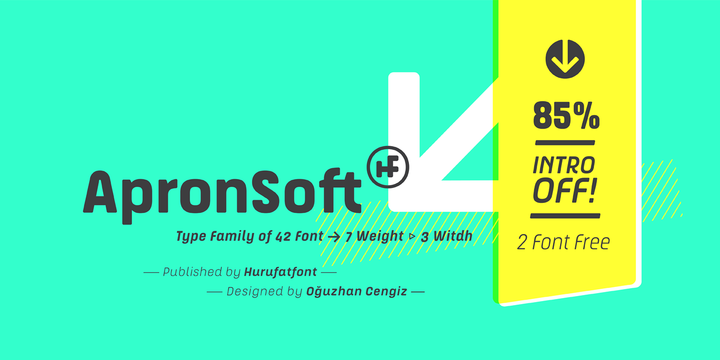
Download ApronSoft Font Family From Hurufatfont Type Foundry

Download Apron Font Family From Hurufatfont Type Foundry
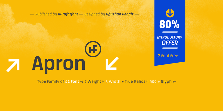
The genesis of Apron font type family is inspired by soft-vertical structure of airplane window. On the other hand Apron is making a reference to technological design mentality of early 2000’s.
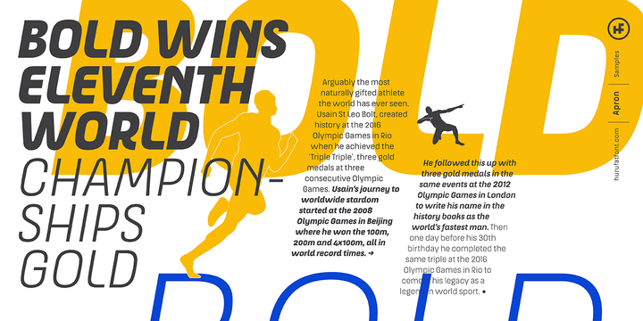
In short texts it has stable view and also humanist effect. Very suitable for mobile apps, web designs, sportive & technological product packs and ads designs. Especially Narrow Bold and Condensed Bold Italic weights have fluid and strong expression for striking headlines.
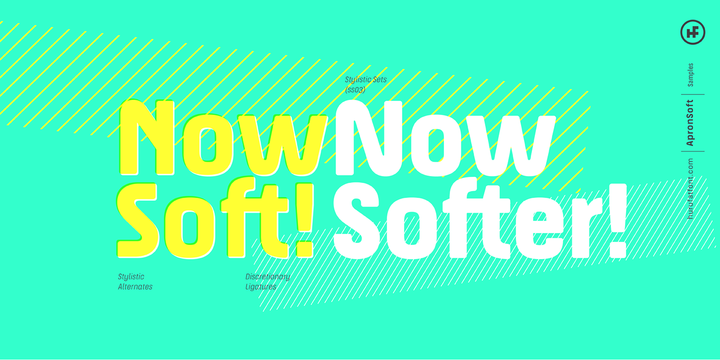
User friendly Apron serves rich opentype properties; small capitals, alternative letters (a, c, e, g, k, l, q, s, y, A, C, G, K, M, N, R, S, 3, 6, 9), stylistic sets, standart and optional ligatures, oldstyle figures, tabular linings, arrows, bullets and wide money currencies, fractions and math symbols.
Now please fasten your seat belts and enjoy it.
Download Galix Font Family From Schizotype

Galix is a technical sans designed to look futuristic without any of the retro appearance often found in this genre. It has a squarish, slightly condensed anatomy, and is characterized by thin joints and deep ink traps that add a sparkle to the otherwise monoline typeface. In the italic styles, these cuts are accentuated even more which creates a feeling of speed in the letterforms.
Galix is optimized for display typography (the ascender height is the same as the cap height, and the spacing is somewhat tight) but the middle weights are very readable at smaller sizes, where I'd recommend adding a little tracking. OpenType features include ft and tt ligatures, stylistic sets/alternates, automatic fractions, tabular, superscript and subscript figures, case sensitive forms.
Perfect for websites, apps, infographics, magazines and logotypes, Galix is technical but with a warmth and personality that is often missing from this genre.
Download Bold Line Icons Font Family From Howcolour
Download Wozniak Font Family From Untype

Wozniak is a workhorse sanserif typeface in 16 styles that includes a 16 styles display font on itself. On its default shapes brings a modern, clear and bright personality to the text and a wide range of possibilities by supporting many OpenType features, such as oldstyle, lining & tabular numbers, small caps, inferiors & superiors, discretionary ligatures, numerators & denominators, extended fractions, case sensitivity forms and more, all carefully crafted and balanced for excellent legibility and optimum performance both on screen and on paper. But that’s not all, every style also includes two complete uppercase sets of display alternates and more than 180 stylistic ligatures inspired by the digital revolution and the early 80s aesthetics. All this blend into a flexible and multifunctional set of over 1600 glyphs, support for more than 200 latin script languages and the potentiality of use in long text settings, headlines or branding, travelling from modern to vintage with absolute ease and naturality.
Wozniak was named after Steve Wozniak as a tribute to the pioneers of the digital revolution.
Download Ray Font Family From Indian Type Foundry

Ray is a light-hearted family of display fonts. Its letterforms were inspired by the kind of typefaces used on digital displays. The family includes five variants, each of which shares the same character width, inter-character spacing, and OpenType features. They are each derived from a strict grid. Ray One’s letterforms make use of a series of dots overlayed on top of a background grid. The capital letters, lining figures, and lowercase ascenders are nine dots tall. The x-height is seven dots. The descenders have two dots worth of space available below the baseline. The Ray Two fonts uses squares instead of dots. These all run into each other, but still present a pixelated effect to the texts they set. Those squares are rounded off in Ray Three, making this style appear like a combination of the Ray One with the Ray Two font. Ray Four adds bridges between many of the gaps found between the grid units visible in Ray Three. These rounded elements from Ray Four are in turn re-squared in Ray Five, making that font look like a cross between Ray Two and Ray Four. The fonts in the Ray family include both lining and oldstyle figures, as well as several alternates for letters like the ‘Q’, ‘R’, ‘S’, and ‘g’. Ray come from Satya Rajpurohit, the Ahmedabad-based type designer who co-founded the Indian Type Foundry.
